Designing in Words: How AI Turned UX Designers Into Their Own Frontend Engineers
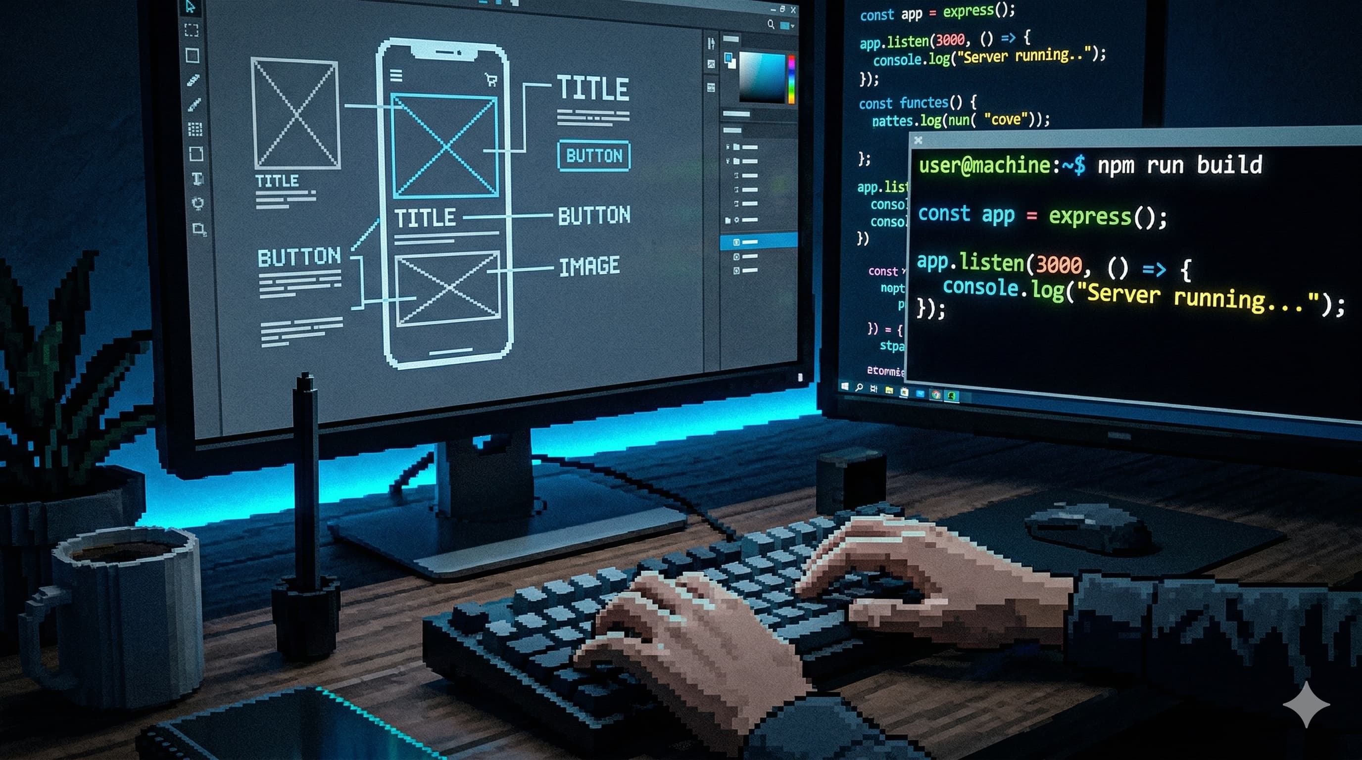
The design review went perfectly. You handed off a Figma file that was pixel-perfect: the right spacing, the right micro-interactions, the hover states, all of it. Three weeks later, the thing that shipped looked like it was built from memory by someone who saw your design once in a dream. Sound familiar?
That story has been playing on loop for the entire history of digital product design. The designer creates. The developer interprets. Something gets lost, always. Sometimes a lot. And the designer files it under “developer error” and moves on to the next project.
I’ve been sitting with this question for months now, for reasons that aren’t abstract. I run a web design and hosting agency called UXNodes, and I’ve been building an AI product design workshop alongside my friends at Xperience. Both of those things exist because of the same bet: that designers who learn to work with AI will have more leverage, not less, in a market that is genuinely brutal right now. There’s a recession on. The job market for designers is objectively hard. And the common wisdom says AI is going to make it worse. I think the common wisdom is wrong, but only for a specific kind of designer.
AI just changed the math on that handoff problem.
Not by replacing developers (let’s be clear about that before the takes get out of hand) but by giving designers a new surface to work on. One where the Figma file is no longer the final artifact. Where a product designer with the right vocabulary and discipline can produce something real, functional, and deployable. Where “pixel perfect” stops being a complaint and starts being something you can guarantee yourself.
This is what vibe coding looks like when a UX designer does it seriously.
1. The Permission AI Just Gave You
There’s a quote from Robert Martin, Uncle Bob, that hits differently once you’ve used AI to build something from scratch:
[!quote] “At some point, you touched a computer and the computer did what you wanted. You made it do what you wanted it to do and you realize that you were a god.”
Every developer who’s been in the craft for a decade knows that feeling. Most designers have never had it, because the path between idea and working interface has always required someone else’s hands.
AI collapsed that path. Not completely, not without friction, but enough.
If you’re an experienced designer, you already know the fundamentals. You understand visual hierarchy, spacing systems, interaction patterns, component architecture. You know what makes something feel premium versus cheap. You know the difference between a transition that builds trust and one that creates anxiety. That knowledge didn’t disappear. AI just gave you a new way to deploy it.
The critical insight is this: your Figma file was always a blueprint, not a building. An architect’s floor plan isn’t the house. It’s a contract between intent and execution, one that passes through other hands, gains interpretation, loses nuance along the way. AI lets you hold the pen all the way to the end.
[!important] This isn’t about replacing developers. Senior engineers solve problems that AI can’t: complex state management, performance architecture, distributed systems thinking. But for the visual and interaction layer? That’s your territory. AI lets you claim it.
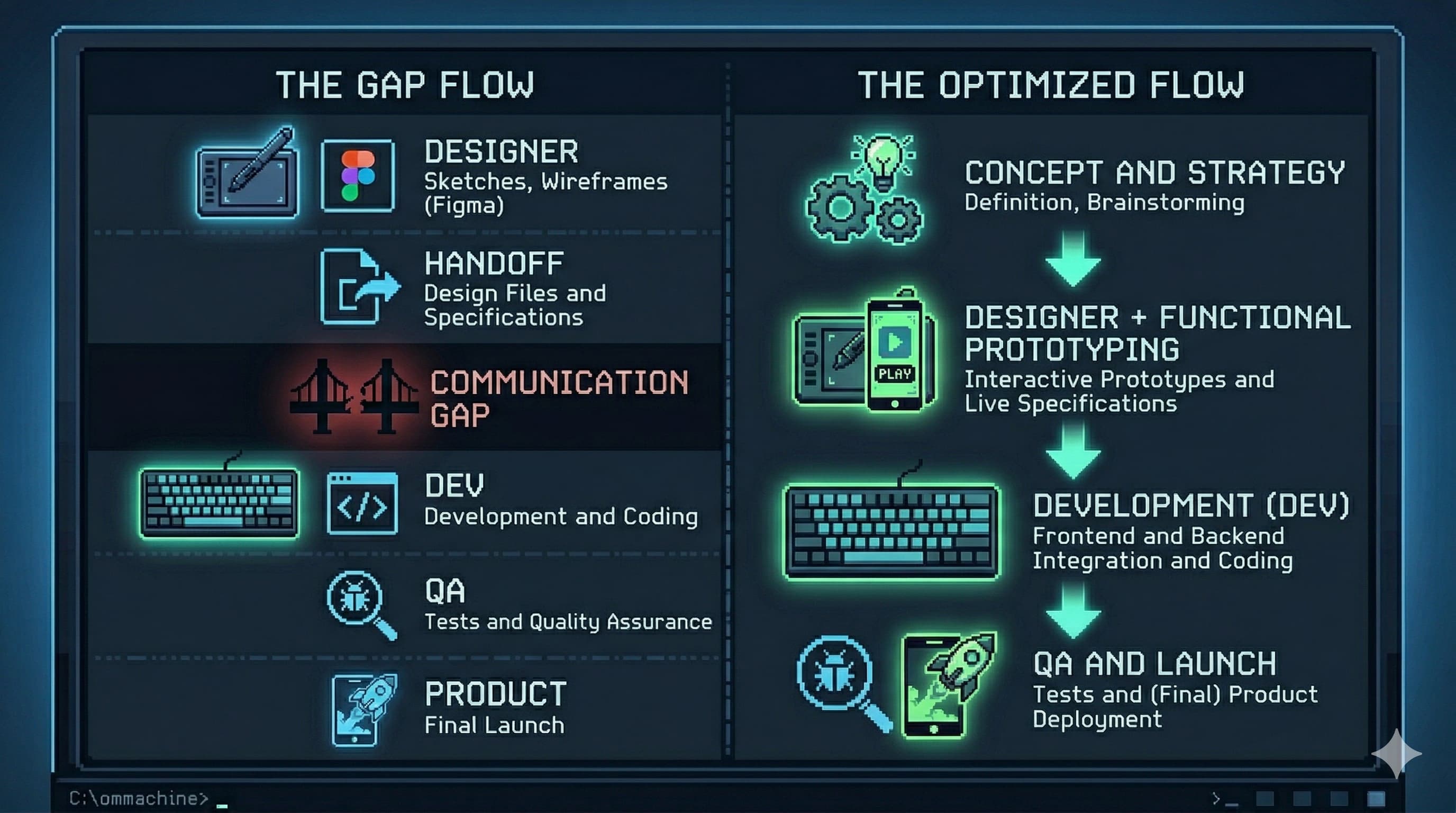
The handoff gap has always been where your intent gets diluted. AI closes it.
2. The New Core Skill: Designing in Words
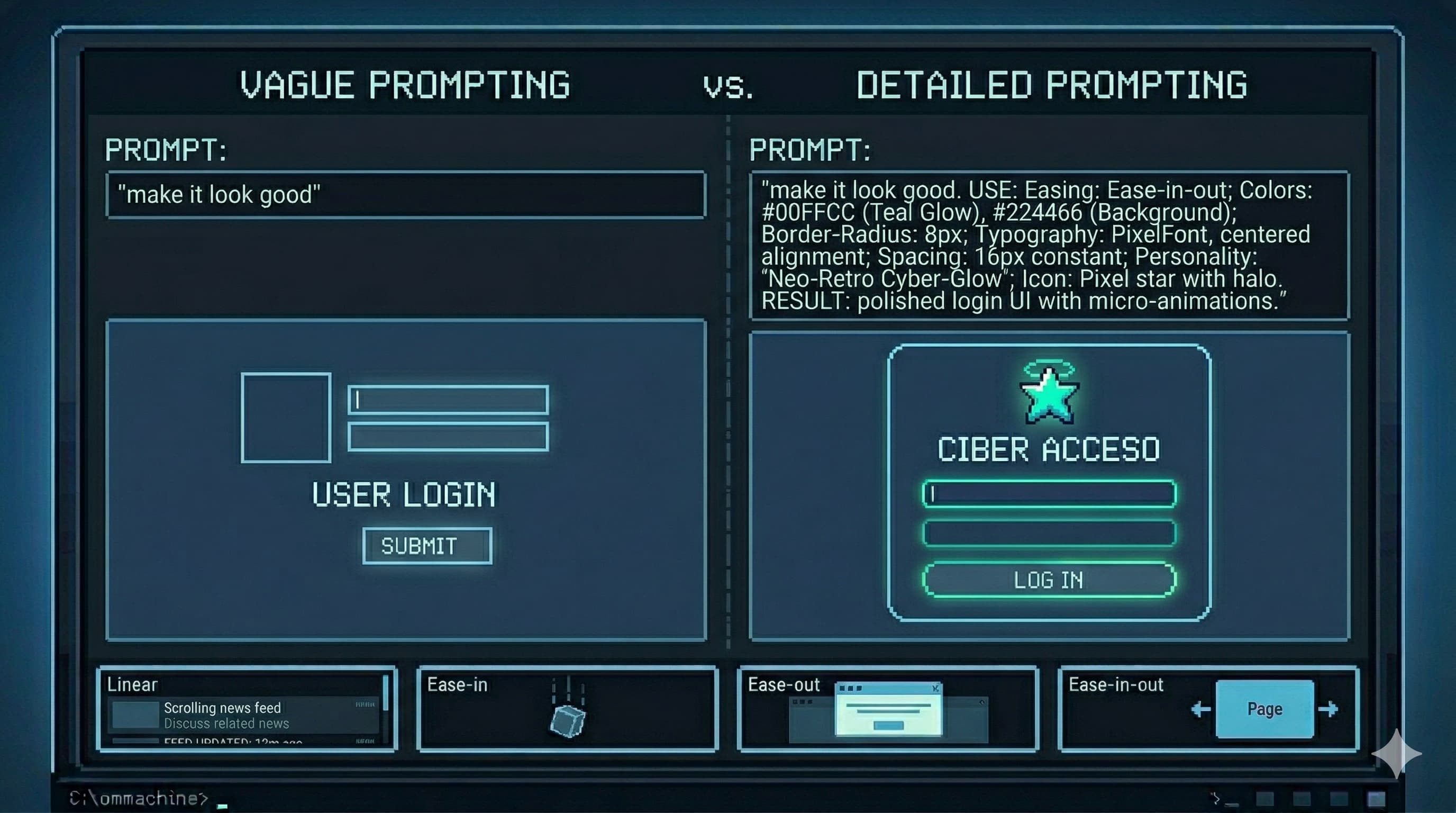
Here’s where most designers stall out when they try to vibe code: they sit down with Claude or Cursor or v0, type “make it look good,” and are disappointed when it doesn’t match what was in their head. Then they conclude that AI “can’t really do design.”
The problem isn’t the AI. The problem is that they tried to skip the hard part.
The hard part is learning to design in words.
This is the actual skill the AI era demands from designers. Not JavaScript. Not React. Not even CSS, though some CSS vocabulary helps enormously and we’ll get to that. What AI needs from you is precision and specificity in language. The same design obsession you apply to a Figma file needs to transfer to your prompts.
Think about how you describe a button to a junior designer: “Make it more premium.” Now think about what that actually means: the weight of the typography, the corner radius (or the deliberate absence of one), the hover state behavior, the color contrast ratio, the relationship between padding and label text. That’s what the AI needs to hear. Not the vague instruction. The translation of your trained eye into vocabulary.
A mediocre prompt produces mediocre output. A prompt written with designer-level precision, one that specifies the easing curve on the hover transition, the exact shade shift on press, the way a shadow lifts, produces something that actually matches intent.
[!warning] If you believe your vibe coding workflow will be “open Claude, describe a design loosely, ship”: stop. That’s not vibe coding. That’s delegating without direction. The quality of your output is a direct function of the quality of your input.
The designers who are going to thrive in this era aren’t the ones who learn to code. They’re the ones who learn to write with the obsessive precision of a senior engineer combined with the visual judgment of a senior designer. Those two things together, fed into a well-prompted AI, produce output that was previously only possible with a dedicated frontend engineer.
The gap in output quality is always traceable back to the gap in prompt quality.
3. The Vocabulary Gap: How to Close It
There’s a specific domain where the vocabulary gap costs designers the most: motion and interaction design.
You know what a good micro-interaction feels like. You’ve seen the card that lifts just right on hover, not too far, not too fast, with a shadow that grows in a way that implies real depth. You’ve felt the difference between a modal that feels snappy and one that feels sluggish. You have the aesthetic judgment. What most designers lack is the technical vocabulary to describe what they’re seeing to an AI, which means the AI produces generic motion that makes everything feel the same.
Here’s the minimum vocabulary that separates good AI-assisted motion from generic AI-assisted motion:
Transitions vs. Animations
These are different tools that get conflated constantly.
Transitions are state changes, the move from A to B triggered by an event like hover or click. You define the start state, the end state, and the duration. The browser handles the middle. For most UI interactions, transitions are what you want.
Keyframe animations are independent sequences. They don’t need an event trigger; they can loop on page load, pulse, breathe. You define multiple waypoints (0%, 50%, 100%) to create complex motion like a loading spinner or a notification badge that pulses with life.
When you describe an interaction to AI, be specific: “This is a hover transition, not an animation. The element stays in place, only the background color and shadow change.”
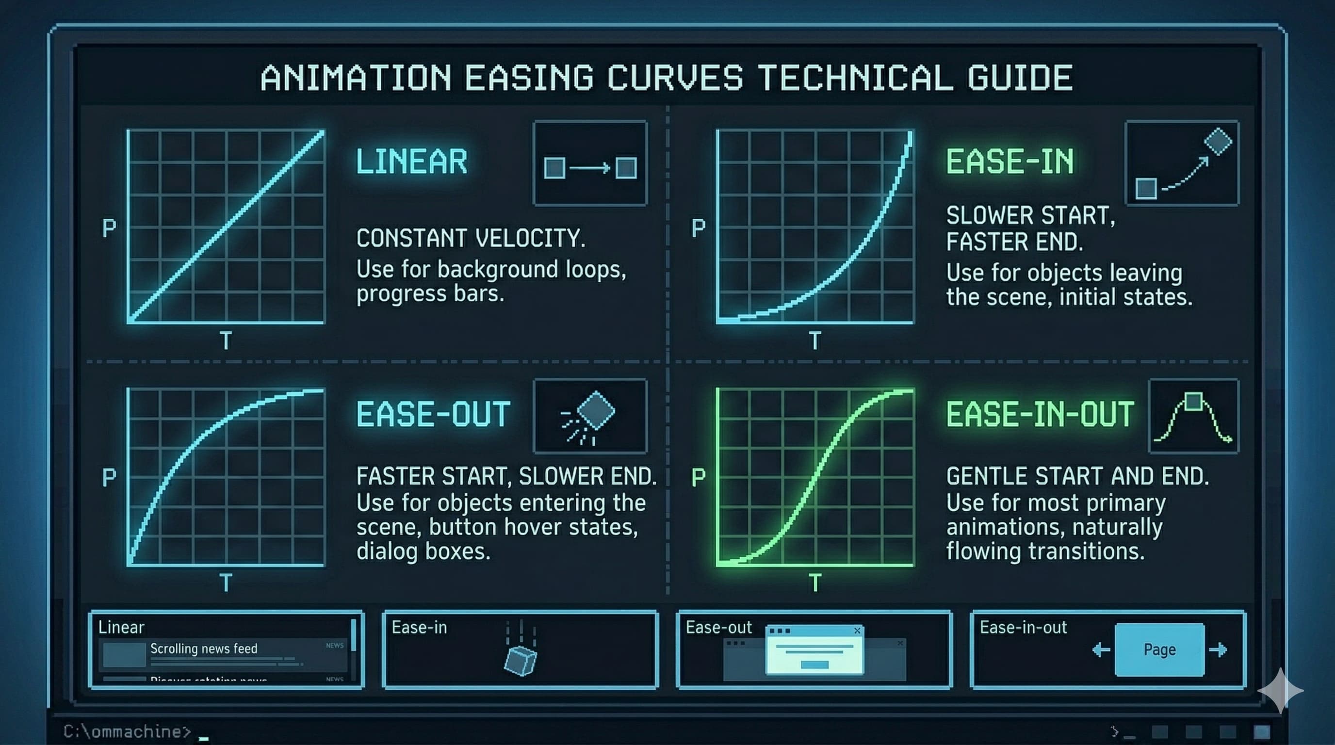
Easing: The Difference Between Cheap and Premium
Nothing signals production quality in motion design more reliably than easing. Interfaces that feel cheap are usually using linear or the default browser easing. Here’s what actually matters:
ease-out: Starts fast, decelerates to a stop. This is the gold standard for elements entering the screen: menus opening, modals appearing, cards sliding in. The fast start feels responsive. The gentle stop feels physical and grounded.ease-in: Starts slow, accelerates. Use this for elements exiting: drawers closing, toasts dismissing. Something leaving should feel like it’s being pulled away, not pushed.ease-in-out: Both ends are eased. Good for elements that are always on screen and changing state: a toggle, a tab switch, a progress indicator.cubic-bezier: Full control. When you need a specific feel, like a slight overshoot or an aggressive acceleration curve, this is how you define it precisely. Think of it as drawing the velocity curve by hand.- Spring physics: Common in modern frameworks like Framer Motion. Instead of a fixed duration, you define mass, stiffness, and damping. This produces natural bounce and overshoot that feels physically grounded in a way no bezier curve quite replicates.
When you prompt for motion, specify the easing: “Use ease-out with a 200ms duration. No bounce, no overshoot, just clean deceleration into the final state.”
What to Animate (and What Never to Animate)
For 60fps performance, animate only two types of properties:
transform:translateX/Y/Z,scale,rotate, for movement, size, and rotationopacity: for fades
Never animate width, height, margin, padding, or positional properties like top and left. These force the browser’s layout engine to recalculate the entire page on every frame, causing the visual stuttering known as “jank.” A designer who knows this, and communicates it explicitly to the AI, ships interfaces that perform as well as they look.
Staggering: When Lists Need to Feel Alive
When a list of cards, nav items, or rows enters the screen, having them all appear simultaneously makes the interface feel mechanical, like a spreadsheet loading all at once. Staggering applies an incremental delay, typically 40-80ms, between each element’s entrance. The first element appears immediately, the second 50ms later, the third 100ms later. The result is a cascade that feels considered and intentional.
Specify it explicitly: “Apply a stagger delay of 60ms between each card entrance, using ease-out for each individual card’s translateY transition from 20px to 0px.”
[!info] This vocabulary, easing, staggering, transform vs. layout properties, is the delta between a designer who gets generic AI output and one who gets output that matches their vision. You don’t need to write this code. You need to describe it with enough precision that the AI writes it correctly for you.
Easing is the invisible layer of craft that separates a premium interface from a generic one.
4. A Workflow That Actually Produces Results
The real unlock isn’t a single prompt. It’s a system. Here’s what works in practice:
The Plan File
Before opening any AI tool, write a plan.md: a design specification in your own words, then refined with AI assistance. This document should cover:
- Visual direction and art direction: What’s the aesthetic? “Aggressive brutalism,” “calm minimalism,” “playful but structured.” Specific enough that someone else could make consistent decisions from it without asking you.
- Color system: Not just hex values, but intent. What percentage of the interface lives on the primary background? When does the accent color appear and when does it explicitly not?
- Typography: Two fonts maximum. What’s the relationship between display and body? Specific weights, tracking adjustments, line-height rules.
- Motion philosophy: How fast or slow is the overall tempo? What easing style governs the system? Which elements animate and which are deliberately static?
- Component rules: Corner radii, shadow depths, border treatment, button states.
Here’s what a plan like this looks like in practice. This is a real excerpt from a gym website spec written before touching any AI tool:
## Visual Direction
Aggressive brutalism: no border-radius anywhere, heavy typographic hierarchy,
photography treated with grayscale + high-contrast filter. The interface should
feel like iron and discipline, not wellness.

## Color System
- Background: #000000 (80% of all surfaces)
- Secondary surfaces: #111111-#1A1A1A
- Accent (CTAs only): #E8FF00 (Industrial Yellow)
- Body text: #F5F5F5 (reduces screen bleed)
- Meta text: #888888

## Motion Rules
Transitions only, no looping animations on page load.
All hover states: 150ms ease-out. No bounce, no spring.
Page transitions: none. Hard cuts only.
The more complete this document, the more consistent the AI’s output across the entire project. Think of it as your design system expressed in prose, a living spec that the AI treats as ground truth.
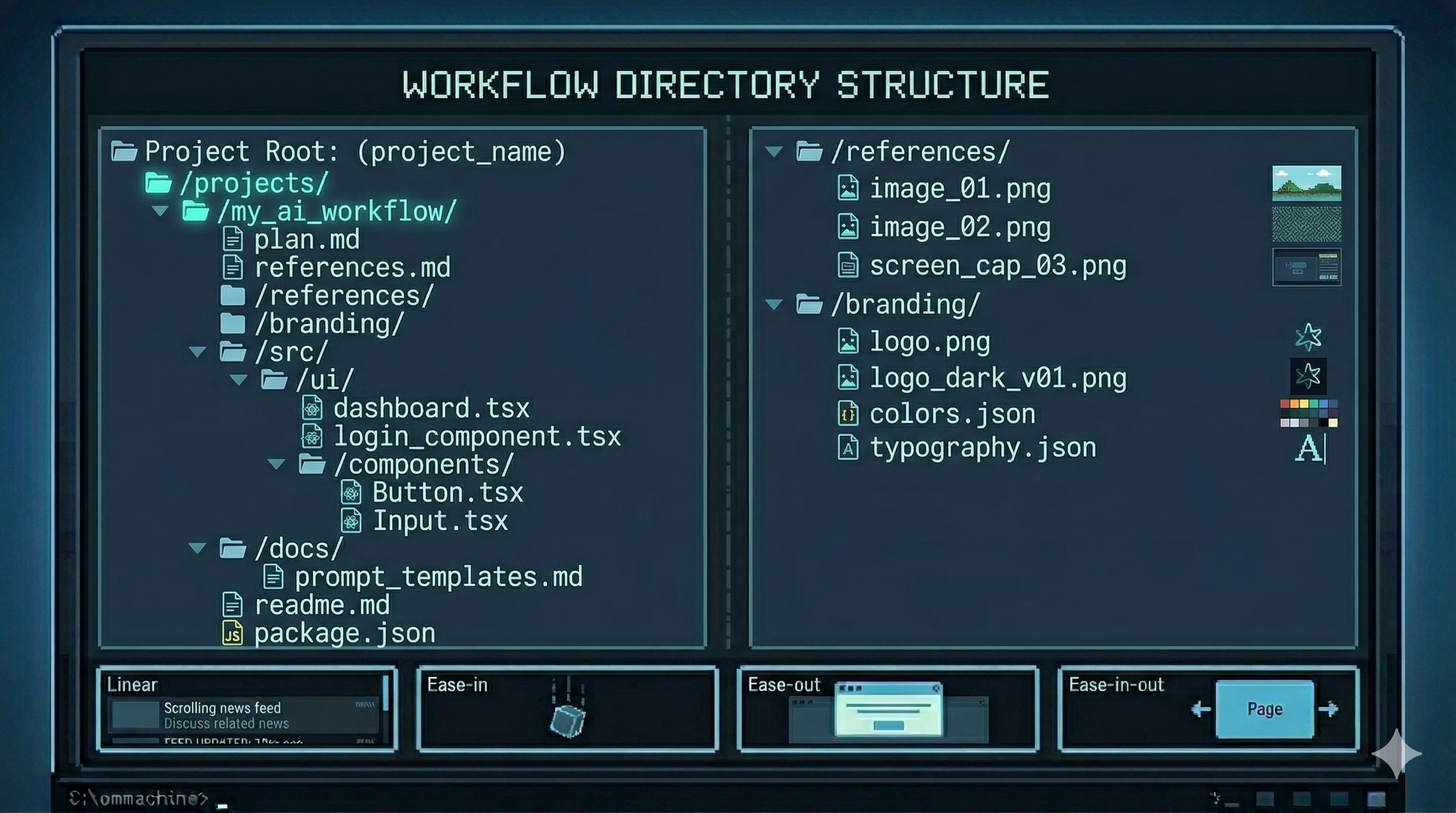
The Reference Stack
Alongside the plan, build a references.md file: links to existing work that captures the aesthetic you’re targeting. Ten to twenty references isn’t excessive. More experienced designers spend proportionally more time gathering references than executing, because a well-aimed effort beats a large unfocused one.
Add a /references folder of screenshots for when the AI can’t browse URLs, and a /branding folder with logos, color swatches, and existing brand assets.
The Prompt That Connects It All
Once your materials are assembled:
Using @plan.md and @references.md as your primary specification, build a [page/component]
for [niche]. The /references and /branding folders contain visual context.

Ask all clarifying questions before starting work. Do not begin implementation
until you have 95% confidence in the requirements.
That last instruction is critical. AI systems are optimized to be helpful, which often means starting immediately rather than asking the questions that would produce better output. Explicitly requiring the AI to pause and clarify first, before a single line of code, produces dramatically more consistent results on visual work, where ambiguity compounds fast.
Structure before output. The quality of your materials sets the ceiling on your results.
5. What This Actually Demands From You
There’s a version of this conversation that ends with “and then AI does everything and you just review it.” That’s not the version I’m describing.
The bar for designers just rose. Not because AI does less, but because AI enables more, which means more is now expected from the people directing it.
The senior designers will thrive. They have the aesthetic judgment, the vocabulary of design fundamentals, and the systems thinking to direct AI productively. AI amplifies what they already have.
Juniors face a harder path. The entry-level production work that used to be the learning ground, simple screens, variation on established patterns, asset cleanup, is increasingly handled by AI. Juniors need to develop judgment faster than before, without as much low-stakes repetition to develop it in.
The ones who plateau are those who stop practicing fundamentals. The moment you stop designing in Figma because “AI can do it,” you stop sharpening the eye that makes your AI output good. Vibe coding is powerful precisely because experienced designers have a high bar for what “good” looks like. That bar atrophies without practice. The AI doesn’t know your bar fell; it’ll happily produce mediocre output and you’ll stop catching it.
Some resources worth adding to your stack if you’re serious about building the vocabulary and reference library this workflow requires:
- Designbinders — visual style vocabulary when you know the aesthetic but not the name
- Component Gallery — for naming the UI pattern you’re trying to describe to the AI
- Navbar Gallery — reference when navigation decisions need grounding
- Fonttrio — fast type pairing for AI-driven design sessions
- 21st.dev — community prompts for replicating specific web effects
- Landing Love — animated landing page references
- Mobbin — mobile pattern reference when designing for small screens
The designers who will be irreplaceable aren’t the ones who learned to code. They’re the ones who learned to direct AI with the precision, taste, and systems thinking that comes from years of actual design craft, and who kept sharpening that craft even as AI took over the execution layer.
AI can copy. It can synthesize. It can execute with precision when given a precise spec. What it cannot do is tell you that this particular hover state feels slightly off in a way that erodes trust, or why the stagger delay on these cards needs to be 60ms and not 80ms, or what “premium” means in the context of your specific brand and audience.
That judgment lives in you. AI is the vehicle. You’re still the designer. Don’t outsource the part that makes you valuable.