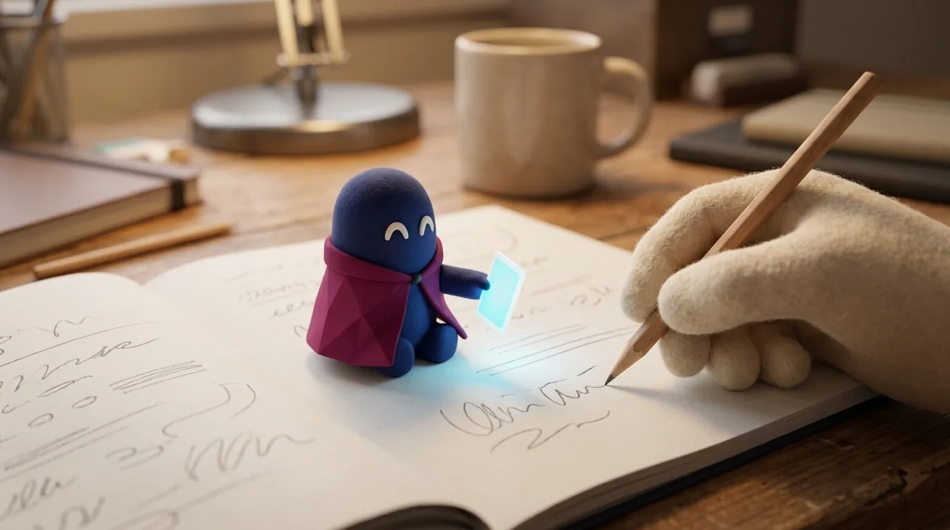
Inline AI: helping users where they already work
Inline AI appears inside the task, not in another window. How Notion, Copilot and Gemini in Docs do it, and how to design suggestions that don't break flow.
What is it in practice?
It is the difference between asking an assistant in another tab and asking for help with the same text you are writing. A document editor that offers to rewrite or summarize a paragraph when you select it is using inline AI. A code editor that completes the line you are typing is too.
This approach departs from chat as the single container. ParallelHQ, in its guide to AI UX best practices, frames it this way: embed the intelligence directly into the space where the user is already doing the work, and have the AI read the screen’s context to offer timely, relevant suggestions. Without that context, the suggestion arrives late or doesn’t fit.
If you want to compare this with conversation, read chat vs. structured UI. And if what you need is for users to request actions with a prefix, see slash commands.
Which products do it today?
Three examples, with data taken from their official documentation on November 2, 2026:
| Product | How the help appears | How it is controlled |
|---|---|---|
| Notion AI | You select text or blocks and choose “Edit with AI”, or press the space bar in a page. With /AI Block you insert a block that generates content from a prompt | Options include editing the page, reviewing a section (fixing grammar, making it longer or shorter) and creating new content such as an outline or an email draft |
| GitHub Copilot in VS Code | Suggests the rest of the function as you type | Tab accepts, Esc rejects all suggestions, Alt+] and Alt+[ (Option on macOS) cycle through alternatives. Next edit suggestions mark with an arrow in the gutter where another change may be needed |
| Gemini in Google Docs | A Gemini icon opens a bottom bar where you type a request without selecting anything; if you select text, the floating bar offers “Refine” | Refine offers rephrase, shorten, elaborate and summarize; you can also move the conversation to a side panel |
Each product offers more than one way in: on the selection, at the cursor or from a bar. And control is explicit and cheap: in Copilot, one key to accept and another to reject. For more on the second case, see GitHub Copilot.
Why does it matter to a designer?
Because switching context is expensive. Every time a person leaves their document to ask a chat, they lose their train of thought, copy and paste text and then come back. A suggestion that appears where the cursor is removes that jump.
But it has a risk: the suggestion that interrupts. A pop-up, or text that moves while you type, breaks concentration. Designing inline AI is mostly an exercise in discretion: the help should be there when asked for and should not insist when it isn’t.
Microsoft’s Guidelines for Human-AI Interaction (HAX Toolkit, 18 guidelines) back this up. Several apply directly: G3 “Time services based on context” (decide when to act or interrupt based on the task), G4 “Show contextually relevant information”, G8 “Support efficient dismissal” and G9 “Support efficient correction”. Three baseline rules follow:
- A subtle trigger. ParallelHQ recommends discreet elements such as floating action buttons or menus that appear on highlight, and cites as an example the small sparkle icon Notion AI shows on selected text.
- Distinguishable content. This is a design recommendation, not a standard: make the proposed text look different from the user’s text, for example in grey, so it is clear what the person wrote and what the system proposed.
- An honest state. Guideline G10, “Scope services when in doubt”, asks the system to narrow down or clarify when it is unsure. If the AI doubted or lacks information, the interface should say so, not bury it under polished visuals.
How do you apply it in a product?
A solid inline AI pattern has five parts:
- Context-based trigger. The suggestion appears when the user is already in a task that justifies it: they selected text, filled a field, opened a table.
- Placement in the flow. The proposal appears next to the content it changes, not in a distant panel.
- Source signal. A label such as “Suggested by AI” and a distinct visual style make generated content recognizable.
- Three exits. Accept in full, accept in parts, or dismiss (guidelines G8 and G9). If the user can edit the proposal in place before accepting, even better.
- Cheap feedback. An upvote or downvote, or a way to tell the system to stop repeating a suggestion; guideline G15 asks to encourage granular feedback. Then measure: how many suggestions are accepted, how many are edited and how many are dismissed.
Focus and accessibility count too. If a suggestion appears and focus jumps to it without notice, the user loses their place. Check how the change is announced to screen readers and how it can be reached with a keyboard.
When NOT to use inline AI
- When a standard flow is clearer. If the task is better solved with a menu or a shortcut that has no AI, don’t add AI just because you can.
- When the action is irreversible. Deleting, sending or publishing needs an explicit confirmation step, not a suggestion applied with a distracted click. Guideline G16 asks to convey the consequences of the user’s actions.
- When the answer needs a lot of context. If help requires exploring, asking and clarifying, chat or plan mode is usually better.
- When the suggestion is slow. A suggestion that arrives after the user has already written what they meant gets in the way more than it helps.
Example
Illustrative example: a meeting notes editor. While the user writes the minutes, they select a long sentence and a small “Summarize” button appears. When pressed, the summary shows in grey below the original sentence, with two buttons, “Replace” and “Dismiss”, and a “Generated by AI” label. The person never left the document, and the original text stays intact until they decide. If the summary changes something important, they can correct it in place before accepting. Before applying it, the user sees the change, as in previewing changes.
Common mistakes
- Opening a chat window every time the user needs help, instead of solving the problem in place.
- Applying the suggestion directly, without showing what changes.
- Styling the proposal like the user’s own text, so nobody can tell what is theirs.
- Using a trigger that fires just because the pointer moved over the screen.
- Forcing the mouse to accept or reject, when Tab or Esc would be faster.
- Not designing what happens when the AI lacks enough context: it should say so, not make things up.
Sources
- ParallelHQ, “AI UX best practices”: https://www.parallelhq.com/blog/ai-ux-best-practices
- Microsoft, HAX Toolkit, “Guidelines for Human-AI Interaction” (G1 to G18): https://www.microsoft.com/en-us/haxtoolkit/library/
- Notion, “What is Notion AI? FAQs”: https://www.notion.com/help/notion-ai-faqs
- GitHub Docs, “Getting code suggestions in your IDE with GitHub Copilot”: https://docs.github.com/en/copilot/how-tos/get-code-suggestions/get-ide-code-suggestions
- Google, “Write & edit with Gemini in Docs”: https://support.google.com/docs/answer/13447609