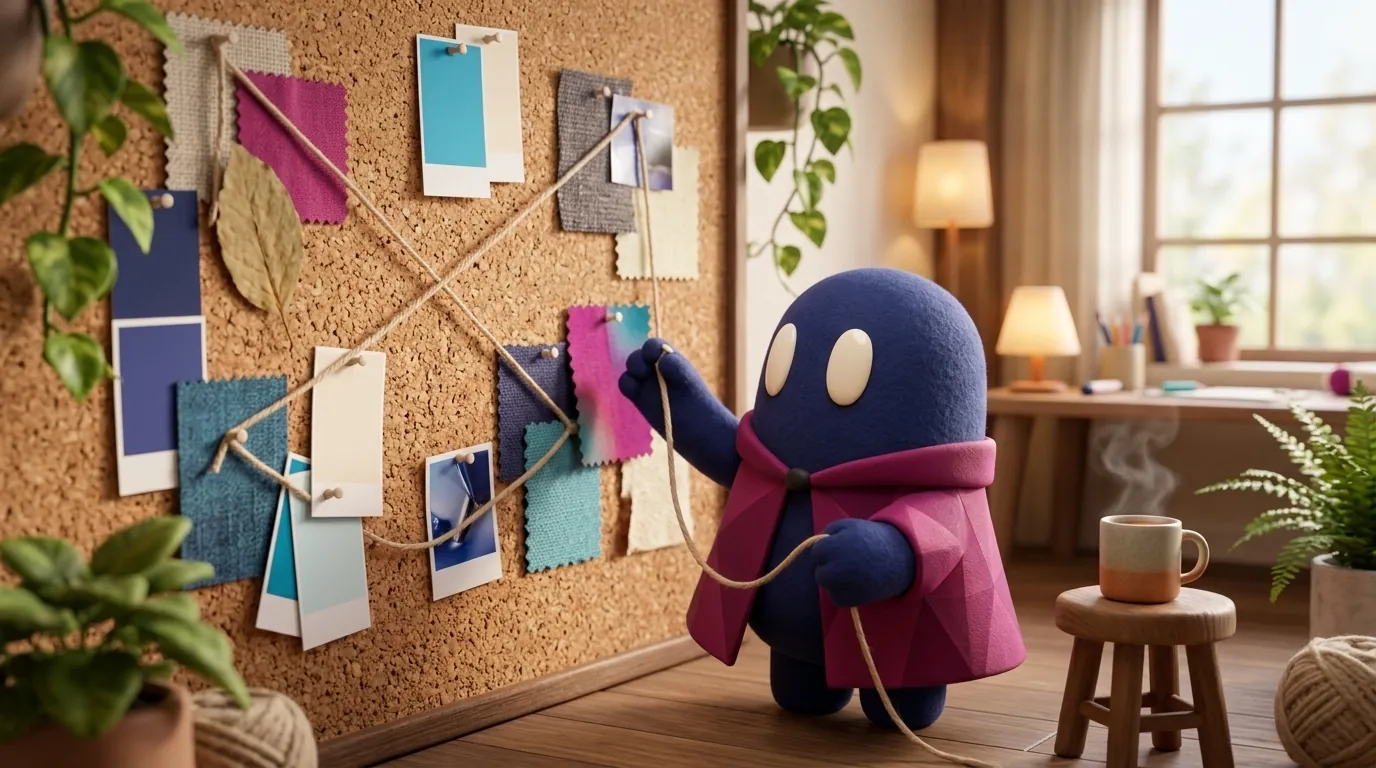
Moodboards: Visual Direction Before the First Pixel
A moodboard is a collage of images, colors, and textures that shows the feeling a product should convey. When to make one, how to build it, and what to avoid.
What is a moodboard and what is it for?
It is a communication tool, not an execution tool. NN/g describes it as a collage that conveys a feeling at a glance, showing the feelings or values the digital product should create (NN/g, “Mood boards”). Design Project defines it as a visual tool that communicates design direction and makes complex concepts visible (Design Project, “Moodboards in UX design”).
Its value is that the whole team sees it at once. A word like “sober” or “warm” means different things to each person. A board with concrete images reduces that ambiguity and stops the team from arguing about a button’s color when the real problem is elsewhere.
Why should a designer care?
Because visual direction is the first thing decided and the last thing that can be corrected cheaply. If the client discovers in the third review that they expected a warmer style, you have lost weeks. Catching that mismatch with a five-minute board is far cheaper.
It also gives you a framework for saying no. When someone asks for “something more premium”, you can ask whether premium means the type of photography, the density of information, or the typography, and the board helps you pin it down.
It also protects you from a common mistake: designing the first version around your own taste. When the direction comes from a board the whole team has seen and discussed, the decision doesn’t depend on who speaks loudest or who has the most seniority.
When is it worth making one?
NN/g places it at the start of a new product or a large redesign, in phases such as define or ideate, before prototypes (NN/g). UX Design Institute is more specific: start once you have done the user research and defined the personas, because the visual direction should answer a concrete problem (UX Design Institute, “Mood boards for UI designers”).
The practical sequence is: research, personas and problem, then the moodboard, then wireframes and prototypes. If you make the board without research, you will have a nice collage that decides nothing.
How do you build one?
The steps in NN/g, UX Design Institute, and Design Project are very similar:
- Review the existing brand. If there is an identity or guidelines, start there.
- Choose the mood words. NN/g recommends four or five, written as concrete adjectives (“motivational”, “energetic”, “bright”). Decide first what you want to convey, then search for images.
- Gather references. Images, colors, textures, and typefaces that evoke those words. Looking outside digital design (nature, architecture, fashion) gives more varied material, according to Design Project.
- Organize with hierarchy. The most important item is larger or closer to the center. Avoid mixing contradictory themes.
- Share and ask for feedback. UX Design Institute suggests testing it first with people who are not involved in the project, then presenting it to stakeholders.
NN/g suggests making several boards to test different moods and comparing them: you look for common ideas and for differences. If the differences are large, there is a conversation to have before moving on. To generate variants faster, see AI moodboards.
Example
Illustrative example: a digital insurer wants an app for older customers, and the brief says “modern but friendly”. The team makes three boards. The first, with dark fintech interfaces and gradients, conveys modernity but coldness. The second, with hand illustrations and warm colors, conveys friendliness but looks childish. The third, with real photography, large typography, and sober colors, combines both. The client chooses the third, and the team turns it into criteria: high contrast, body text at least 18 px, photographs of real people. Those criteria then feed the project’s type scale.
When NOT to make a moodboard
- When the direction is already decided. A board made to justify a decision that was already taken is theater.
- When the project is a small improvement. Adjusting the spacing of a table doesn’t need a collage.
- Without prior research. Without people and a clear problem, the board reflects taste, not needs.
- To define component rules. That work belongs to the style guide and the design system.
Common mistakes
- Filling the board with screenshots, so the conversation is about features instead of feelings. NN/g warns that moodboards are about visuals, not features, and that too many screenshots shift attention to them.
- Presenting a single direction, which turns the meeting into a yes-or-no decision.
- Polishing each image when the goal is to communicate an idea.
- Letting the client think the references will be copied as they are.
- Mixing styles that contradict each other and that nobody can defend.
How to start tomorrow
Before your next direction meeting, write four adjectives that describe what the product should convey, words nobody can misread. Find two images per adjective and build a simple board on a single screen. Show it to three people, one of them from outside the project, and ask what product they imagine from it. If what they imagine matches what you want, move on to wireframes. If not, change the images, not the words.