Storyboards: telling the experience in panels
A UX storyboard tells, in panels, how a person lives an experience: scenario, visuals and captions. How to make one, which fidelity to use and when not to.
What is it and where does it come from?
The concept comes from animated film. Adobe XD attributes it to Walt Disney’s studios in the 1930s, and the language later moved into product design. In UX, a storyboard is not meant to be a final piece. Its job is to map key events and give emotional context to a sequence of actions.
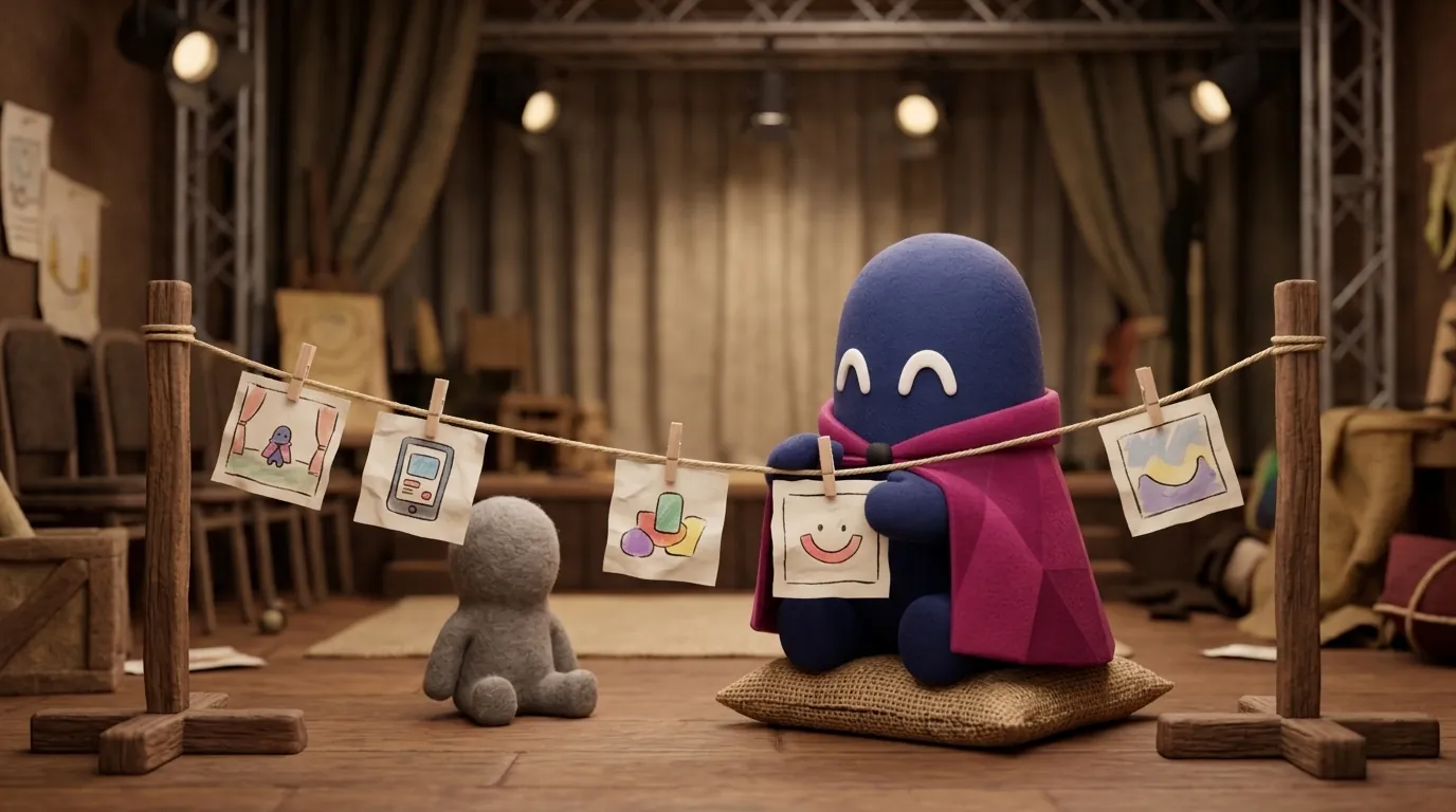
NN/g (Rachel Krause) defines it as a story told through a sequence of image panels. What matters is not the drawing but the sequence: what happens first, what the person feels and what happens next.
Why does it matter to a designer?
Because screens explain what the product does, but not why it matters to someone. A storyboard forces you to look at the moment before and after each interaction: where the person was, what motivated them, what they expected and how they felt when the result did not arrive.
It also helps alignment. Among the uses NN/g lists are summarizing usability test sessions (with user quotes and body language), adding user context to a journey map, building a shared understanding for prioritization, and ideation, where the storyboard is a conversation tool rather than a lasting artifact. A team discussing a five-panel storyboard usually agrees faster than one discussing forty screens.
NN/g also draws the line with the journey map: a storyboard is image-driven, narrow in scope and used mostly within one team; a journey map is broad, text-heavy and shared across departments to find pain points.
How do you make one, step by step?
NN/g proposes a six-step process:
- Gather data. Interviews, usability tests or metrics that support the scenario.
- Choose the fidelity according to the goal and the audience.
- Define the persona and the scenario. One storyboard per user path.
- Plan the steps by writing them out with arrows and adding an emotional-state icon to each.
- Create the visuals and add brief captions on the action, environment, emotional state and device.
- Share, get feedback and iterate.
Adobe XD adds a useful nuance: the scenario should describe the environment, the persona with their frustrations and emotions, the goal they want to solve and a narrative arc with a beginning, a middle and an end. That structure stops the storyboard from becoming a list of clicks.
What fidelity should you use?
NN/g says low fidelity is the most valuable. Sketches or sticky notes serve brainstorming; photos or video stills serve usability test recordings; detailed illustrations serve client presentations or design deliverables. The more polished it is, the longer it takes and the harder it is to change, which works against the conversation you are trying to have.
Captions should be brief. NN/g recommends no more than two bullet points per image, because the visual is the main content. If you need to explain more, the scene probably mixes two moments. Digital.gov, in its storyboard method, asks for each scene to be annotated with what the user is attempting to do and estimates one to two days of work depending on the scenario’s complexity.
One path per storyboard?
Yes, and it is an important rule. When a storyboard tries to cover several paths, it becomes a flowchart. NN/g sums it up: “it’s not a flowchart, it’s a storyline.” The solution is to make one storyboard for each relevant path. If the user can reach the same result by two routes, the storyboard of each will tell you which feels more natural.
When should you NOT use one?
- When the flow is linear and simple. A user flow or a wireframe tells the same story with less effort.
- When the question is about logic, such as what happens if the card is declined. A decision diagram serves that better.
- When there is no user data. A storyboard without research behind it is a well-drawn fantasy.
- When the panels are polished before the problem has been discussed.
Example
Illustrative example: a school transport app team wants to understand why parents stop using it after the first week. Using the previous week’s interviews, it builds a storyboard for a mother with two children and a rigid work schedule. Four panels: the mother receives a delay alert, looks for the driver’s number, cannot find it in the app and calls by phone. The caption of the third panel reads: “I expected to see the bus location and the driver’s contact without leaving the app”. The team discovers the problem is not the location but the contact. They make it a priority before redesigning anything.
For your next project: pick one scenario from your product, draw it in five panels without thinking about screens, and ask in which panel the person hesitates. That is the screen that most needs attention.
Common mistakes
- Polishing the drawing before validating the scenario.
- Mixing several paths in one storyboard.
- Drawing screens instead of moments in the person’s life.
- Writing long captions that compete with the image.
- Forgetting emotion, which is what distinguishes a storyboard from a flow.
- Not basing the scenario on real research data.
Related in the wiki
For the logical side of the experience, user flows are the natural complement. To see the journey over time and its touchpoints, look at customer journey maps. And to define who lives the scenario, personas are the foundation.