United Gamers Esports Platform
How a Strategic Redesign Transformed an Unusable MVP into a $250,000 Seed Round
Problem
A powerful vision trapped in an unusable app. No users and no ability to attract investors.
My Role
Product & UX Strategist. Led the complete review, from vision to visual execution.
The Solution
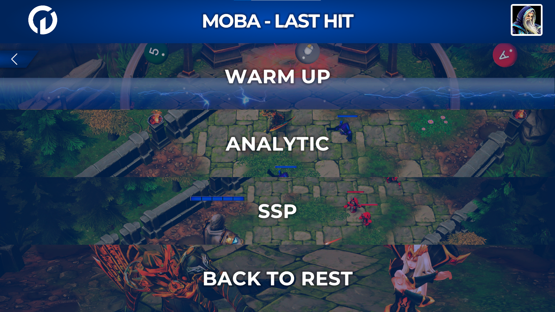
Strategic pivot to "low-poly" style for accessibility and a flow focused on the "first match".
The Result
Transformation into a demonstrable MVP that enabled securing a $250,000 seed round.
1. The Context: A Vision Trapped in an Unusable Product
United Gamers had an ambitious vision: a science-backed esports training platform with structured exercises to help League of Legends players improve specific skills through repetitive, targeted training. The approach was mentored by top-tier performance coaches, including trainers who worked with Formula 1 pilots.
Think of it as “Duolingo for League of Legends”—structured skill progression with expert-designed training exercises targeting specific gameplay mechanics.
The vision was brilliant. The execution was broken.
When I joined as Product & UX Strategist, the company had spent a year building an MVP that, on paper, sounded impressive. Science-backed training exercises, skill-focused modules, detailed performance tracking. But in practice?
The Reality:
- Technical Performance: The app was heavier than League of Legends itself. Load times exceeded 3-5 minutes on average PCs.
- Visual Design: The team tried to replicate League of Legends’ high-fidelity graphics. The result was ambitious but unachievable with their budget and timeline. Everything looked unfinished and inconsistent.
- User Retention: Zero. Players couldn’t complete a single training session without crashes or bugs.
- Investor Appeal: Undemonstratable. You can’t pitch an app that doesn’t work.
The company was running out of runway. They needed funding to survive, but investors won’t fund broken products—no matter how good the vision is.

The Stakes:
Without a redesign, the company would die. But a superficial facelift wouldn’t save it. We needed a foundational transformation—one that would make the product usable, shippable, and fundable.
2. The Mission: Forge an Investable MVP
My mission wasn’t to “make it prettier.” It was to transform the product into something that could:
- Work: Players could actually use it without crashes.
- Demonstrate value: Show the core experience (expert-designed training) in action.
- Sell the vision: Give investors a tangible artifact they could believe in.
The Plan:
- Diagnose the critical failures (technical, UX, visual).
- Define an achievable vision given constraints (budget, timeline, team size).
- Design an MVP focused on the “Golden Path” (the one core experience that proves the concept).
Where I Started:
I didn’t start in design tools. I started by asking hard questions:
- Why is the app so slow?
- What are we trying to prove to investors?
- What’s the one experience that demonstrates our unique value?
3. The Diagnosis: Three Critical Failures
I ran a comprehensive audit and identified three blockers preventing success:
Failure #1: Technical Overreach (Performance Crisis)
The app tried to replicate League of Legends’ high-fidelity graphics—detailed character models, complex animations, realistic lighting. The problem? This required massive assets and processing power.
The Result:
- File size: Larger than League of Legends itself.
- Load times: 3-5 minutes on average hardware.
- Target audience contradiction: We were building for casual players who wanted quick training sessions, but the app required gaming PCs to run smoothly.
Players would download the app, wait 3 minutes for it to load, experience a laggy interface, and uninstall. We lost users before they even started training.
Failure #2: Visual Inconsistency (No Identity)
Because the team was trying to match League of Legends’ visual fidelity with a fraction of the budget, the result was a patchwork of inconsistent art styles. Some screens looked polished, others looked like placeholder wireframes. Nothing felt cohesive.
The Result:
The product didn’t look “premium”—it looked unfinished. And investors don’t fund products that look unfinished.
Failure #3: Scope Creep (No Focus)
The MVP tried to do everything:
- Multiple training modes
- Social features
- Ranking systems
- Achievements
- Marketplace
But none of these features worked well. The team was spread thin, and the product had no clear “Golden Path”—the one core experience that proves the value proposition.
The Result:
Players didn’t know what the product was. Training platform? Social network? Game? The lack of focus confused users and diluted the pitch to investors.


4. The Strategic Pivot: Constraints as Opportunities
Instead of fighting the constraints (limited budget, small team, tight timeline), I reframed them as design opportunities.
The Question:
“What’s the simplest, most achievable version of this product that still demonstrates the unique value?”
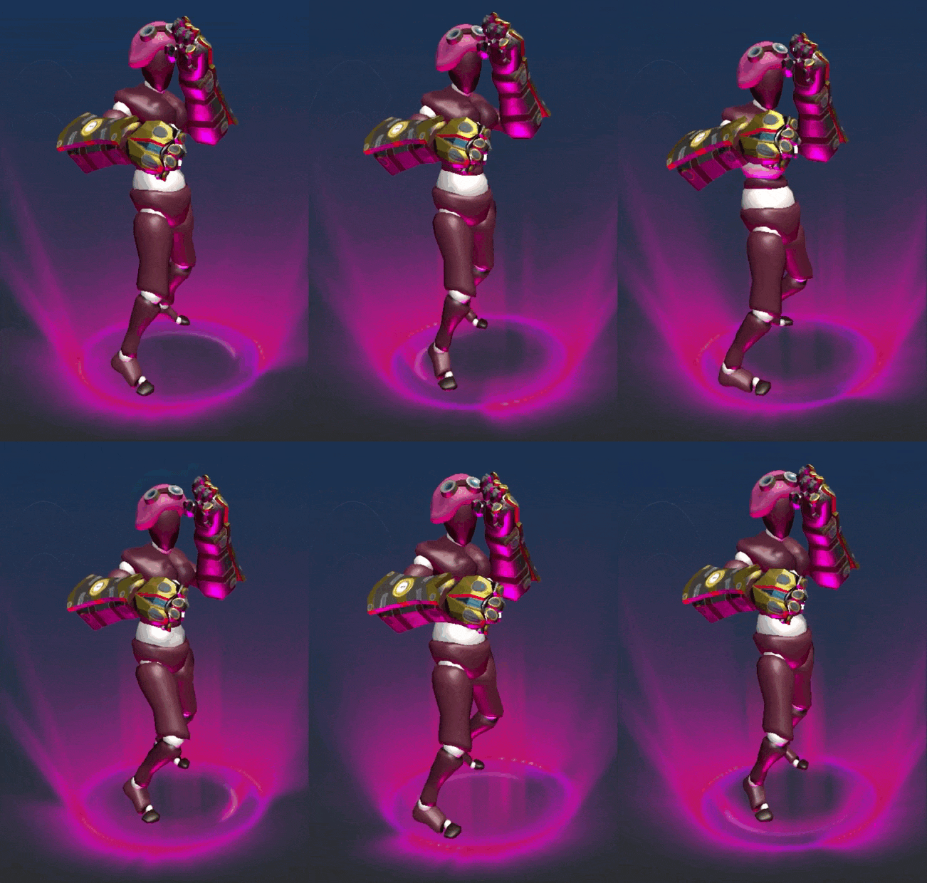
Decision #1: Low-Poly Aesthetic (Solve Performance + Identity)
Trying to replicate League of Legends’ graphics was the wrong strategy. I proposed a radical pivot to a low-poly art style.

Why Low-Poly?
- Performance: Lightweight assets = fast load times. The app could run on any PC, even low-end laptops.
- Visual Identity: Low-poly is distinctive and memorable. It differentiated us from League of Legends instead of trying (and failing) to copy it.
- Development Speed: Simpler assets meant faster iteration. The art team could focus on creating a cohesive style instead of chasing photorealism.
- Aesthetic Appeal: When done right, low-poly isn’t “cheap”—it’s stylized and intentional. Think Monument Valley or Superhot.
The Creative VP was skeptical. “Won’t low-poly make us look low-budget?”
My response: “Only if it’s executed poorly. But if we commit to it fully—consistent style, bold colors, clear silhouettes—it becomes our identity, not a compromise.”

This wasn’t just a visual decision—it was a strategic business decision that unlocked technical feasibility and brand differentiation.
Decision #2: Focus on the “First Match” (Golden Path)
Instead of building 10 half-broken features, I proposed focusing on one perfect experience: The First Training Match.
The Golden Path:
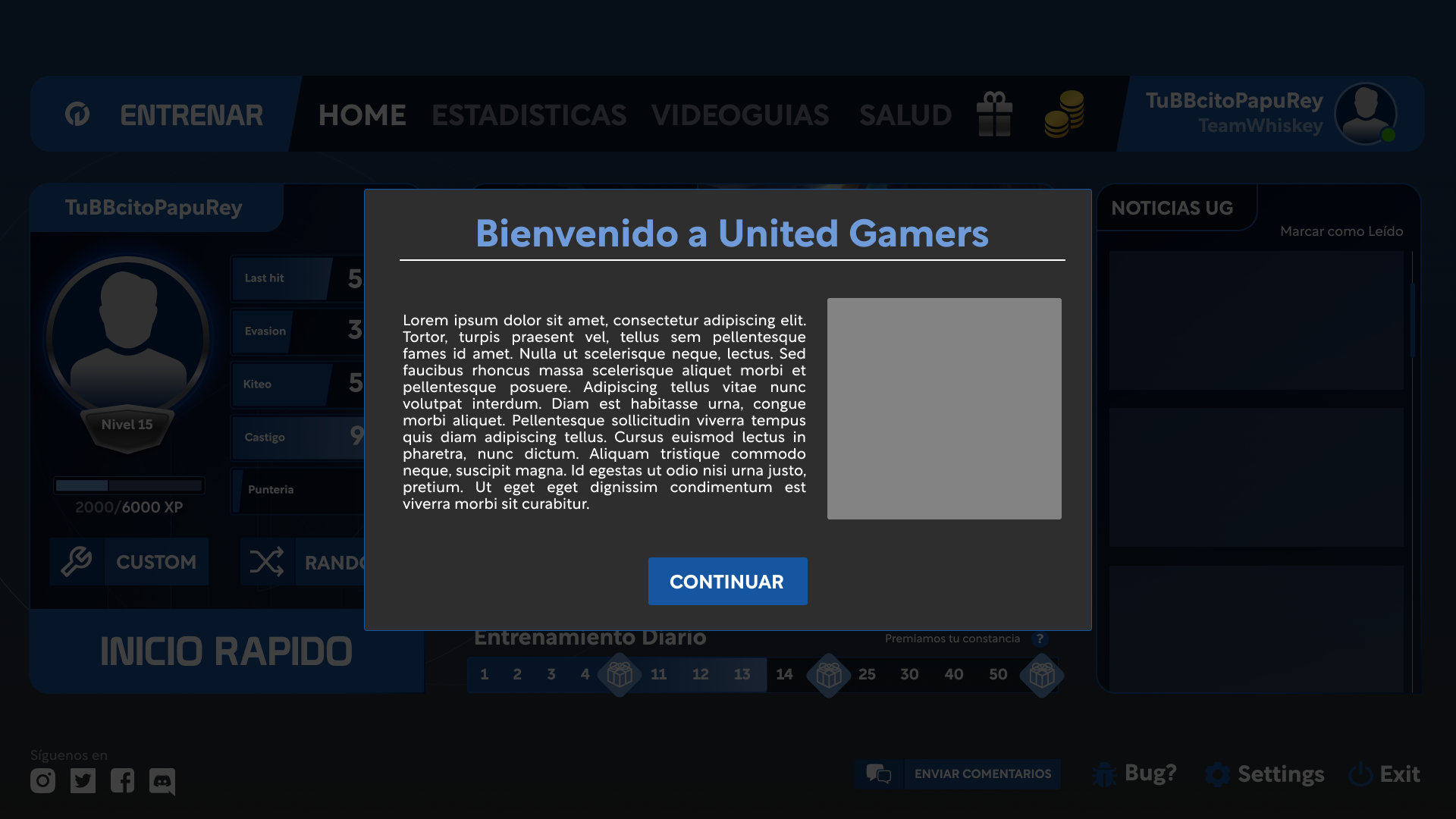
- Onboarding: Sign up in <60 seconds (email or social login).
- Role Selection: Choose your League of Legends role (Top, Jungle, Mid, ADC, Support).
- First Training Session: Complete a single expert-designed training exercise focusing on a specific skill (e.g., last-hitting, map awareness, positioning).
Why This Worked:
- Proves the core value: Players experience expert-designed coaching immediately.
- Short time-to-value: Players can complete the entire flow in 5-10 minutes.
- Demonstrable to investors: We can show this flow live in a pitch meeting.
Everything else (social features, rankings, marketplace) was deprioritized or cut. We would add those later—if we survived.
5. The Execution: Designing for Users and Investors
With the strategy defined, I designed the new MVP with two audiences in mind:
Audience #1: Players (The Users)
Eliminate Friction:
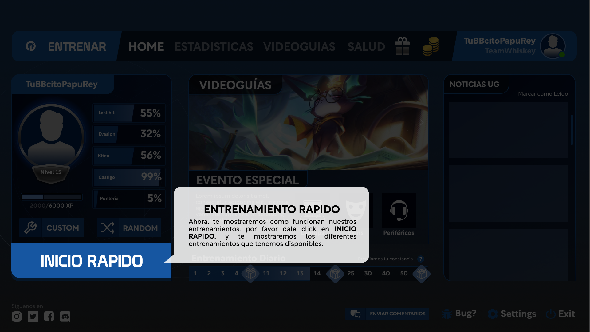
I redesigned onboarding to be frictionless. From landing page → role selection → first training session in <60 seconds. No endless forms, no tutorials, no barriers.
Show Progress Immediately:
After the first session, players see a hexagonal skill chart showing their strengths and weaknesses across key skills (mechanics, map awareness, decision-making). This visual is instantly understandable and motivating.
One Clear CTA:
Every screen had one primary action: “Start Training,” “Continue,” or “See My Results.” No distractions.


Audience #2: Investors (The Funders)
Investors don’t fund wireframes or pitch decks alone—they fund visions they can believe in. The redesigned product needed to visually communicate:
- Professionalism: Cohesive design language (low-poly aesthetic applied consistently).
- Technical Feasibility: Fast, responsive, no crashes during demos.
- Market Fit: Clear value proposition (science-backed esports training).
The low-poly aesthetic wasn’t just functional—it was memorable. In investor meetings, the visual style became a talking point. It showed we were strategic, not just ambitious.
6. The Result: From Un-Fundable to $250,000
The redesigned MVP launched internally first (team testing), then to a small group of beta testers, and finally to investors.
User Validation:
- Completion Rate: 80%+ of testers completed the first training session (vs. 0% on the old version).
- Feedback: “This actually works now.” “I love the art style—it’s so clean.”
Investor Validation:
The redesigned product became the centerpiece of the fundraising pitch. Instead of showing slides and promises, the founders could:
- Demo the product live (no crashes).
- Walk through the user flow start-to-finish in <5 minutes.
- Show the hexagonal skill chart and explain how the science-backed exercises target each skill area.
The visual design wasn’t decoration—it was proof of execution.
Result: United Gamers secured a $250,000 seed round.
This capital allowed the company to:
- Hire additional engineers to expand the training modules.
- Build out the social and competitive features.
- Survive long enough to prove product-market fit.
7. Key Learnings
UX is Strategy: Design Decisions Shape Business Outcomes
My most impactful contribution wasn’t a specific wireframe—it was the strategic pivot to “low-poly” aesthetics. This single decision solved multiple problems simultaneously: technical performance (lighter assets), team velocity (faster iteration), accessibility (runs on any PC), and brand identity (memorable and unique).
This taught me that UX isn’t just about “making things pretty” or “easy to use.” At the strategic level, design decisions directly impact feasibility, go-to-market strategy, and competitive positioning.
Takeaway: Think beyond the interface. Ask yourself: How does this design decision affect development speed? Business model? Target audience? Competitive differentiation? The best UX work solves business problems, not just user problems.
Design for Investors: Your Product Must Tell a Fundable Story
In startups, your MVP isn’t just for users—it’s for investors. The redesigned product needed to visually communicate the company’s vision in a way that was instantly understandable during a 10-minute pitch. The low-poly aesthetic, the clear user flow, and the hexagonal skill chart weren’t just functional—they were designed to be compelling story elements.
Investors don’t fund wireframes. They fund visions that feel tangible. The redesign gave them something they could picture succeeding in the market.
Takeaway: If you’re designing for early-stage startups, remember that your audience includes investors, not just end users. Your MVP should be demonstrable, visually cohesive, and narratively clear. It needs to answer: “Why will this succeed?” in visual form.
Constraints Breed Creativity: Embrace Limitations
The low-poly pivot wasn’t my first choice—it was born from technical constraints (can’t replicate League of Legends’ graphics). But by reframing the limitation as an opportunity, we created something more distinctive and achievable than the original vision.
Takeaway: Don’t fight constraints—leverage them. Budget limits, technical debt, and time pressure can force you toward simpler, more focused solutions that are often better than unconstrained blue-sky designs. The question isn’t “What would I design with unlimited resources?” It’s “What’s the best solution given the resources I have?”