WTFast Activation Redesign
How a designer earned a CTO’s trust by finding what engineering had missed, and turned a 45-second goodbye into 4× activation.
What was actually broken
The product was sabotaging its own users. New gamers opened the app, got routed to the wrong servers by a silent bug, and were gone in 45 seconds. The interface caught the blame.
Where I sat
Design lead on paper. In practice: the person willing to follow the broken behavior across the seam between UX and engineering until something gave.
What we changed
Engineering fixed the routing. I rebuilt the first 30 seconds so users could feel the product working: a five-step flow that started with identity and ended with the game already loading.
What it earned
4× activation. 3× paid conversion. And the moment the CTO said the design wasn't the problem. I'd found the problem. That's the receipt I keep.
1. The product was lying to its own users
A new user downloaded WTFast, opened it, and was gone in 45 seconds. Not annoyed. Not confused enough to ask for help. Just gone, back to the lag they were trying to escape.
Activation sat at 10%. Acquisition was healthy. Partnerships, ads, organic. The top of the funnel was full. The bottom was a hole. Every dollar of ad spend was buying users a one-way trip to the close button.
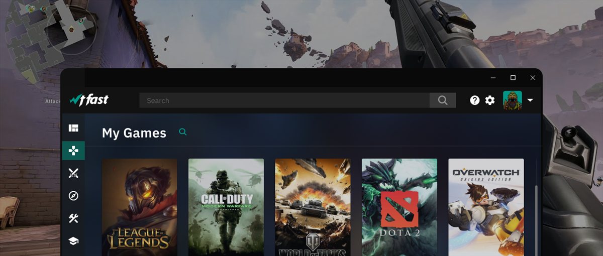
WTFast is a SaaS for gamers: proprietary network optimization that lowers ping in League of Legends, Fortnite, Valorant. The retained users loved it. They were power users with strong opinions about server selection and packet routing. The product had spent years getting better at serving them: more dashboards, more controls, more knobs. None of that mattered to the person opening the app for the first time.
The team’s working theory was that the onboarding needed polish. A cleaner UI, maybe a tooltip pass. The kind of fix you can ship in a sprint and feel productive about.
I didn’t think it was an onboarding problem. I thought the product was lying to people. I just didn’t know how yet.
2. I stopped opening Figma and started watching people leave
The job was framed as a redesign of the FTUE (first-time user experience), anchored to one number: activation rate. The percentage of new users who actually got the product to do its core thing in their first session.
I accepted the framing and ignored the implied solution. Before I drew anything, I wanted to know what the leaving actually looked like. Not in aggregate. Not in a survey. In the moment.
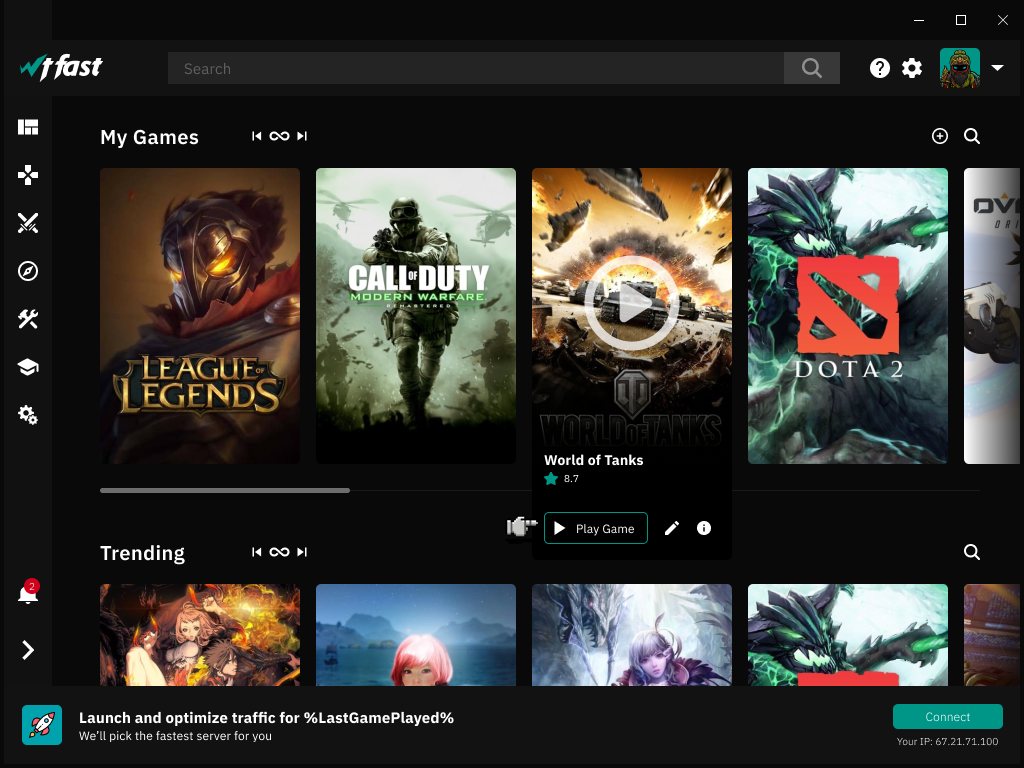
WTFast had an internal JS session-recording tool, the kind of artifact that exists in every mature SaaS but rarely gets watched. I sat down with it and started pulling failed sessions. Then I pulled more. Then more. By the end I’d watched over 2,000 first sessions end in abandonment.
You don’t watch 2,000 people quit your product without something shifting. The pattern was consistent enough to be eerie.
- Install. The user is excited. They came here to fix a real problem.
- First launch. The app offers Automatic or Manual mode.
- Roughly 70% click Manual. They want control. They don’t trust software they’ve never used to pick for them. Fair.
- Manual reveals 200+ servers in a flat dropdown. Dallas 1, Dallas 2, Dallas 3, Los Angeles 5, Singapore 12. No context. No “best for your game.” Just a wall.
- Freeze. Forty-five seconds. Close.
The internal narrative was “power users love manual control, so we should keep it prominent.” The behavior said something colder: new users wanted control because they didn’t trust the product, and the product punished them for it.
That alone was enough to redesign around. But it wasn’t the worst thing I found.
3. The thing the company didn’t know it was doing
While I was watching sessions, I started flagging a different category: people who did trust the automatic mode. They picked it. They waited. And then they got routed somewhere wrong.
A user in New York connecting to Singapore. A European routed through Brazil. Ping reductions that worked on one session and got worse the next. Inside a small percentage of those sessions, the product was actively making the user’s game worse than it was before they installed.
I took it to engineering. Not as an accusation. As a question. Why is the automatic mode picking weird servers?
What we uncovered together is the part of this story I keep coming back to.
WTFast measured server quality by running a ping test from the user’s machine outward: fast, parallel, aggressive. Engineered for speed. The problem was that the test was so aggressive that ISPs were classifying it as suspicious traffic. Some ISPs throttled it. Some blocked it outright. The data coming back wasn’t a real measurement of network quality. It was a measurement of how much each ISP was choking the test itself.
Then the algorithm took that polluted data and confidently recommended the “best” server. Which, for a non-trivial slice of users, was the wrong server.
The product wasn’t bad at picking. It was being lied to by the network it was trying to measure, and it was passing that lie through to the user as a confident recommendation.
Alex Needham, the CTO, came to me directly after we traced it. Not a Slack message. Not a “thanks for flagging.” He told me, plainly, that the design wasn’t the problem. I’d found the problem.
That was the moment the project changed. Not because the bug got fixed. Bugs get fixed every day. Because for the first time in my career a senior engineer treated a designer like someone who could see the product, not just decorate it. Every founder secretly wants that designer. Most of them have never worked with one.
After that conversation, I had the room. Whatever I proposed next, engineering would build with me, not around me.
4. Design, after the product stopped lying
The fix had two layers, and the order matters. Engineering had to go first.
The foundation: making the product honest again
Engineering tuned the ping test. Less aggressive. Slower. Looked enough like ordinary traffic that ISPs stopped flagging it. The latency data started reflecting reality. The algorithm started recommending the right servers.
None of what came next would have worked without this. A polished onboarding wrapped around a broken routing engine is a faster way to lose users. They reach the “value moment” and the value isn’t there. Design after the product is honest is a different exercise than design as a coverup.
The first 30 seconds: turning a wait into a feeling of power
The new ping test took a few seconds. In the old version, that wait was awkward dead air, the kind of pause where users tab away and never come back.
I designed a loading screen for that interval that did one job: communicate that something sophisticated was happening for them. “Analyzing global network. Detecting optimal route. Calculating best server for your game.” Not decoration. Narration. The same number of seconds, framed as the product working hard on the user’s behalf instead of the product making them wait.
This is the move I keep returning to in product work. A neutral moment is a leak. A narrated moment is a promise.
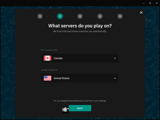
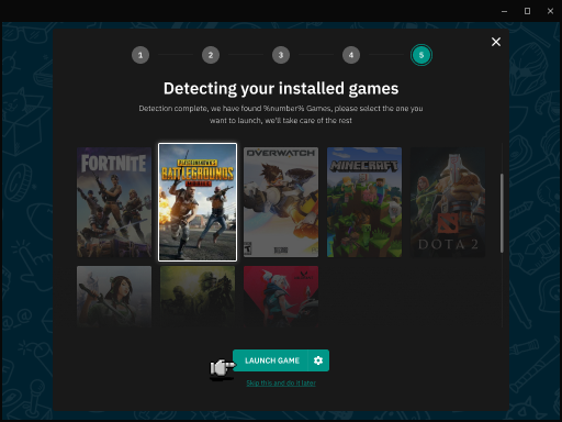
The flow: five steps, three of them about playing
Instead of dropping users into 200 servers, I built a five-step linear flow. The first two were about who the user was. The last three were about getting them into the game.
Step 1. Avatar. Pick your face. A small thing, except it isn’t. By the time a user has chosen an avatar, they’ve stopped thinking of the app as software and started thinking of it as theirs. Two seconds. Free identity.
Step 2. Games you actually play. A short survey: which titles do you log into? League, Valorant, Apex, the rest. This was scaffolding for Step 4, but more importantly it made the user disclose something. Disclosure is investment. Investment is retention.
Step 3. Region. Not “pick a server.” Pick your country, and the country where the game’s servers live. Gamers know this. They’ve been reading region tags on game launchers for years.
Step 4. Game detection. The app scans for the games the user just told us they play and surfaces them. They see their actual library back, not a list of strings. The “magic” is just the product proving it remembered who it was talking to two screens ago.
Step 5. One button. “Launch Game.” That’s it. No advanced toggles, no secondary CTAs, no “are you sure.” The user clicks once, the optimization is on, the game launches with measurably lower ping.
The whole flow runs in under 30 seconds. The advanced controls didn’t go away. They moved to a place users could find after they’d felt the product work once. Which is the only point at which advanced controls actually mean anything.
5. What changed, and what the numbers were really receipts for
We rolled it out as an A/B test. We didn’t have to wait long.
- Activation moved from 10% to 50%. Five times the number of new users actually experiencing what they came for in their first session.
- Trial-to-paid conversion tripled. Users who felt the product work were dramatically more willing to put down a card.
- Unit economics shifted. The same acquisition spend was now buying users who actually paid. ROI per new user roughly tripled, on the same funnel and the same dollars.
Those are real numbers and they ran the business case. But they aren’t what I think about when I think about WTFast.
What I think about is the sentence from Alex. The CTO of the company, the person whose code base I’d been quietly poking at, telling me the design wasn’t the problem. I’d found the problem. That’s the sentence every founder is hoping a designer will earn the right to hear. Most designers never get there because they never look past the screen.
The 4× activation is downstream of that moment. Once the product wasn’t lying anymore, the design just had to amplify what was already true. The loading screen, the five-step flow, the “Launch Game” button. None of it is clever in isolation. What made it work is that it was the first honest version of WTFast a new user had ever seen.
6. What I’d want a founder to take from this
If you only hire designers who polish what you’ve already built, you’ll get a prettier version of your current ceiling. The designers worth their fee are the ones who’ll follow a confused user across the seam between UX and engineering and tell you what’s actually broken. Sometimes it’s the interface. Sometimes it’s the product. Often, when you look closely, it’s the product wearing the interface as a mask.
The mechanism is unglamorous. Watch real sessions until a pattern shows up. Ask engineering questions until something doesn’t add up. When the answer is “that shouldn’t be happening,” keep pulling. The bug you find on the other side is usually worth more than any redesign on its own.
Design didn’t fix WTFast. The diagnosis did. Design made the now-honest product feel inevitable, which, for a first-time user, is the only kind of “working” that counts. If your activation curve looks like ours did, the answer probably isn’t a cleaner onboarding. It’s somewhere underneath, where nobody’s looked yet, waiting for someone willing to ask the second question.